
The Knight is a noteworthy example of the Pre-Raphaelite influence on other artistic movements such as Symbolism and Art Nouveau, and on one of its representative artists in early 20th century Belgium. Both movements inherited the Pre-Raphaelite’s favorite subjects – biblical and medieval themes, poetry and the woman’s staging – as well as its plastic features – vivid colors, lack of depth, taste for detail, shape simplification.
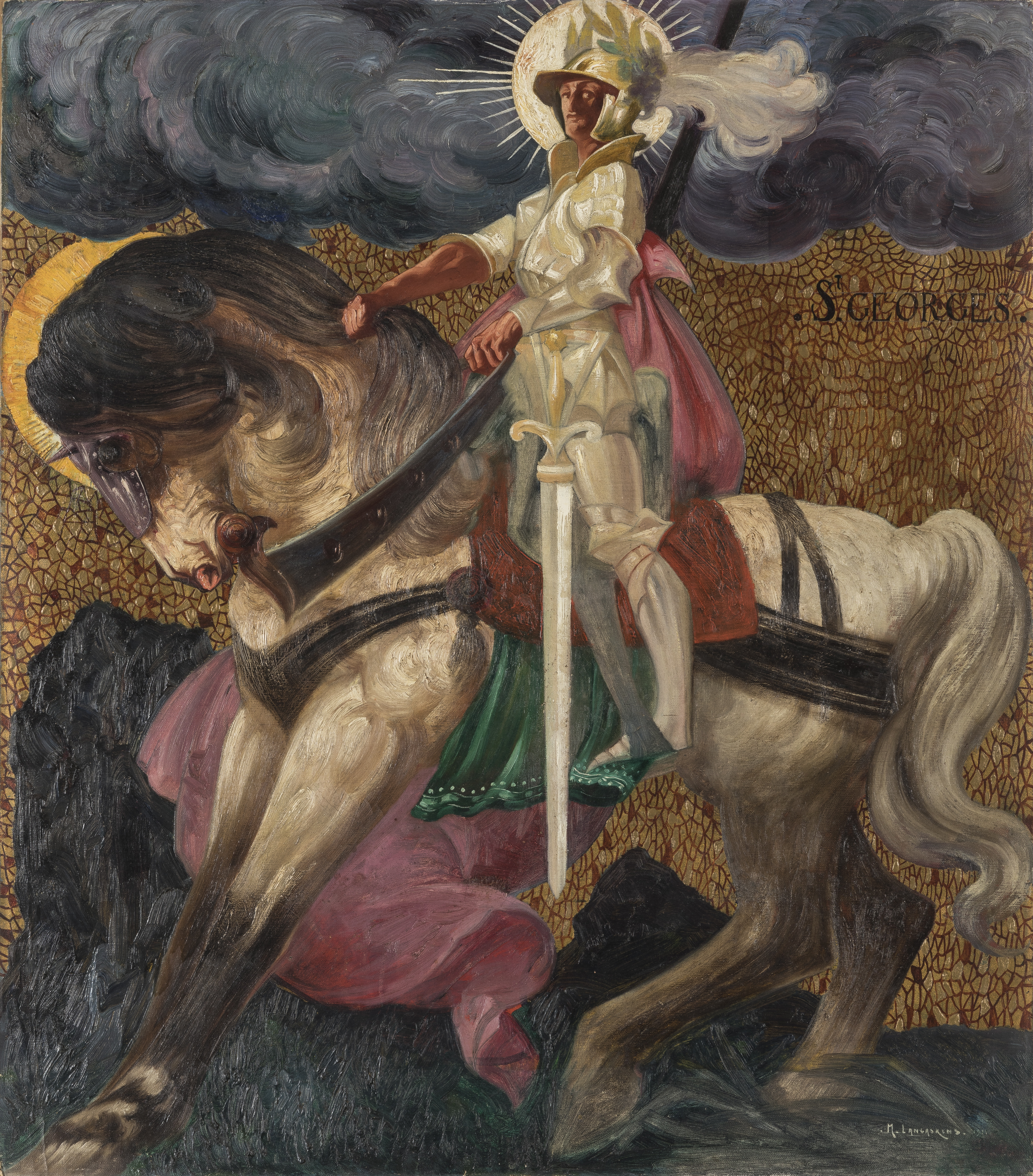
The present representation of a powerful Saint George has its roots from the decorative idealism which characterizes Langaskens’ beginnings. At that time, he was first trained at the Ecole des Beaux-Arts in Paris and then at the Académie Royale des Beaux-Arts in Brussels, with his becoming friend Constant Montald. Langaskens and Montald, both admirers of Pre-Raphaelites, had assiduously attended the Salon de l’Art Idéaliste created by Jean Delville between 1895 and 1898. Investing into this ideal, Langaskens depicted a Saint George more related to the symbol of sanctity than to the tradition of the martyr’s iconography. Displayed as a Roman officer, his helmet crowned by a laurel wreath ,the saint and his horse’s heads are surrounded by a halo. St George occupies the whole of the pictorial surface by proudly standing on his white horse, with his huge blade dividing vertically the space of the composition
The symbolism is also expressed by the choice of colors which reveals the “Langaskens’ art with an intense, deep and living vibration”[1]. The background is dominated by two colors : yellow, symbolizing divine light, and blue, creating a contrast with its bleakness. According to Vassily Kandinsky, these two colors create the first major dynamic contrast in art. Yellow exhales spiritual warmth, whereas blue, when darkened, symbolizes inhuman sadness[2]. Possibly Langaskens made a reference, through colors’ symbolism, to the martyr inflicted to George during Christians’ persecutions. The Knight therefore synthesizes an art predominantly inspired by the elders, the Pre-Raphaelites, but which is also anchored in its own days through the display of Art Nouveau decorative decors and the symbolic use of colors in line with Art Moderne’s pictorial-spiritual theories.
[1] Benoit Schoonbroodt, op. cit., p. 61.
[2] Vassily Kandinsky, Du spirituel dans l’art, et dans la peinture en particulier, 1910, French edition and trad. Nicole Debrand & Bernadette du Crest, Paris, Denoël, pp. 142-151.